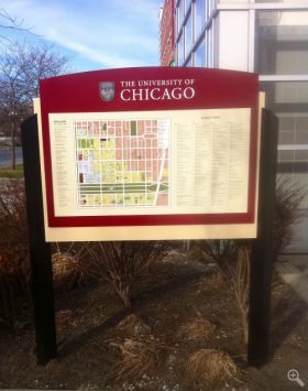
 A new way-finding system for the University of Chicago campus is helping guide visitors who approach Hyde Park by vehicle, with additional help for pedestrians to navigate the campus grounds once they arrive.
The changes include updated signs on roads and highways, clearly identified campus parking, new pedestrian maps at points around campus, and signs that more clearly identify buildings and landmarks around the University. Facilities Services has been carefully developing the multi-stage project since 2009.
“The University of Chicago has one of the most beautiful campuses in the world, with a wealth of cultural destinations, and we want to make it easy for people to get here and enjoy it,” said Richard Bumstead, associate director of campus environment. “Our goal is to offer clear and helpful information, whether you’re a first-time visitor or you’ve been here for decades.”
The first step in planning the new system was to determine what the existing signage lacked in terms of information and visibility, and how well the signs identified the University of Chicago.
“Since 2010, we have engaged an environmental graphics firm to develop the sign types,” Bumstead said, “as well as their design, color palette and placement.” A working committee and a steering committee have been involved in developing the new plan.
The new signage system will be implemented in four phases. The first phase, vehicular directionals and maps, already has been completed. The new signs can be seen coming from the Dan Ryan along 55th Street, on Lake Shore Drive and from the Skyway.
The second phase, pedestrian directionals, are being installed this fall. The final two stages, building signage and regulatory signage, will be the last to be installed.
Project managers also had to address visual and design-related challenges in their planning.
“The new system had to work both for cars being driven 55 mph getting off the expressways and for pedestrians walking through the Quads,” Bumstead said. “We had to be careful about scale, placement and color.”
The new signs are designed to fit seamlessly into the University campus without visual clutter, while being easily noticeable for visitors. Campus buildings that are major public destinations should be easier to identify.
All signs meet ADA guidelines and help address issues like building access.
“Our design team developed small trailblazer ADA signs,” Bumstead said, “to aid guidance to the accessible entrance if it’s not easily seen.”
Besides the signs for vehicles and pedestrians, the signage system includes several other distinctive features. Stone columns help define the campus edges, while larger signs called “gateway markers” signal the arrival onto campus.
Creating a better identification system for campus was not the project developers’ only goal. They also worked to develop a new campus map, which will appear in all publications and web applications. A printed version of the map is available at the Information Center in the Administration Building.
*********************************************


